
Web & Brand Redesign
Worked with healthcare provider to design a brand, that showcases safety, trust and aesthetics. High impact visuals, bold user interface and metrics that prove results

Role : UX & Brand Designer
Duration : 4 months | Apr 2025-Aug 2025
Tools : Figma | Wix
Collaboration : Medical Director & Owner
Responsibility :Brand Identity, Responsive Website, Marketing Collateral (Invoices, Mailers, Business Cards), Social Media Strategy.

About
CoreaesthetiX is a US-based medspa offering cosmetic procedures, injectables, and skincare treatments.
This project became a complete end-to-end rebuild:
- establishing new information architecture,
- structuring services clearly,
- building responsive layouts,
- improving booking clarity,and
- turning scattered brand assets into a coherent digital system.
What wasn’t working before?
The previous website had both structural and credibility issues that negatively impacted brand identity and usability:


The Opportunity
To build a comprehensive brand ecosystem and a high-converting, mobile-responsive website from the ground up, increasing brand visibility and streamlining the client booking experience.

Discovery & "The Messy Middle"
I began with a "pencil-first" approach. Because I was handling the entire scope, I needed to iterate rapidly before committing to high-fidelity pixels.
-
Sketches: I sketched 20+ layout variations on paper to determine the most intuitive user flow.
-
Information Architecture: I mapped out the sitemap to prioritize service listings and the "Contact/Booking" CTA.
-
Translation: I moved selected paper concepts into Figma to refine typography and spacing before touching the Wix editor.
Brand Identity System
A website is only as strong as the brand behind it. I developed a unified visual language to ensure trust and professionalism.


.png)
LOW FIDELITY SCREENS

FINAL SCREEN DESIGNS
.png)
Clean booking forms - easy to understand & only asks for necessary details

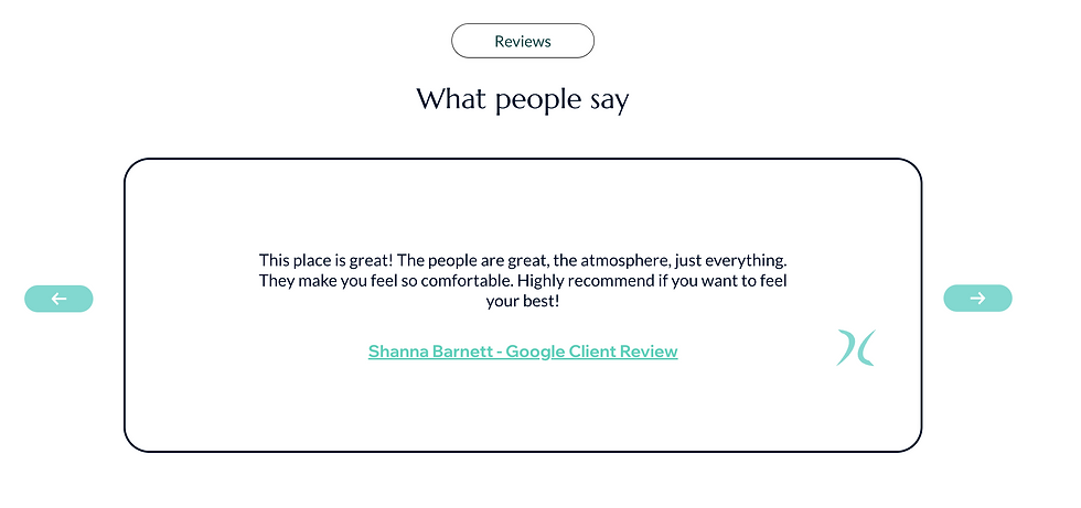
Traceable Reviews - better credibility to the site and what people say
Meet the team bio cards - letting clients know who their doctors are, creating trust


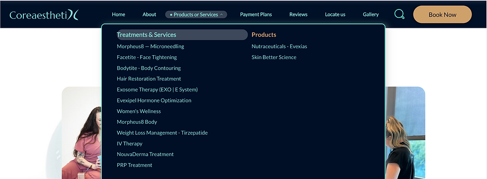
Detailed navigation bar with easy to access treatments, reducing jargons, and categorizing treatments & products
The unified approach, where the visual brand communicated trust and the information architecture delivered clarity, directly addressed the core user anxieties.
Measured Impact:
Increase in Consultation Bookings: 25% Increase
Decrease in Bounce Rate: 15% Decrease
Time on Site: 40% Increase (Indicating deeper engagement with safety/trust content).